
Just back from U-Hall...
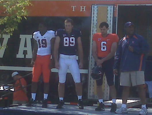
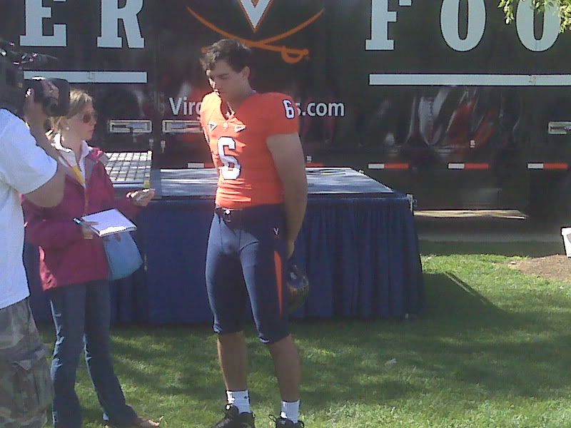
I think the uniforms look great. Nothing drastic changed, except to maybe clean up the whole look and add in the orange jersey and pants for the mix & match options ala Oregon.
The so-called "goat horns" are gone and the blue on the helmet has a metallic sheen, so I think we can safely say we're back to having the best helmets in college football.
These uniforms, although very modern in technology, are clearly designed to have a simple, old school feel to them from the visual standpoint. The color combinations have both 80's and 90's looks, especially when throwing the black cleats and low white socks. The pants do have more detail with the striping on the side and back, the hip logo, and the "Wahoos," "Virginia," and/or "Hoos," on the back (depending on pant color.)
I think these unis look very sleek, but are still obviously classic UVA uniforms. Maybe a little bit like Boise State with the possibility of the blue/orange combos and like Florida with the orange/white.
I love the contrasting borders around the numbers.
Overall, I was expecting a bigger splash ("Oregon of the East," these unis are not), but I'm very happy with the results. They aren't gaudy.

Think we'll ever go orange/orange? Overall, I like.
ReplyDelete(I do wish these pictures were better. I didn't think to bring my camera today. Stupid!)
ReplyDeleteCoach London said we'd use all nine uniform combinations, and that alternate helmets could also make an appearance at some point in the future. He said they would use the Oregon model of allowing the players to vote on which uniform combo to use, prior to each game.